Case Study  ·  UY  ·  Design System  ·  2022
Infrastructure
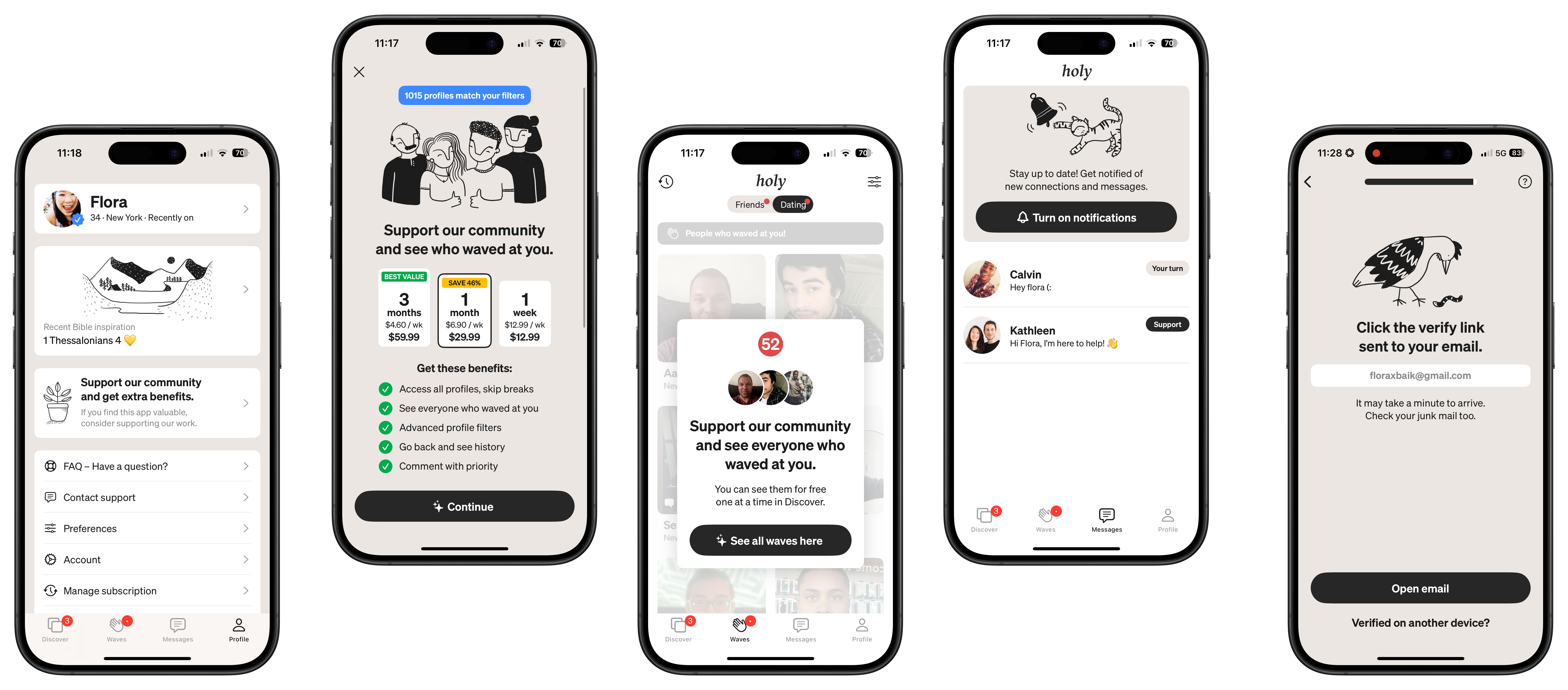
UY app mobile screens

How I enabled start-up founders to scale design/development

Role Design System Manager
Category Design System
Client UY (Christian dating app)
Duration 4 months
Context

UY is a Christian dating app that had grown to revenue-positive by 2022. The founders were capable product people — they had shipped a real product, found real users, and made real money. What they didn't have was the time or energy to build the design system that would let their team scale without them.

Problem

As the team grew, design inconsistencies compounded. Two different typography systems existed across the app. Components were duplicated and unnamed. Developers and designers were working from different sources of truth. Every release required manual QA just to catch alignment drift. None of this was a skill problem — the founders knew what they needed. It was a bandwidth problem. Building a design system requires focused, uninterrupted time that founders building a product don't have.

What I did

I came in as the infrastructure layer — not to design new features, but to build the foundation that would let the team design and develop faster going forward. That meant auditing what existed, standardizing what should be shared, and handing it back as a system the team could own and extend without me.
Impact
100%
Team adoption of the unified design system
Faster concept-to-release timeline after system launch
30%
Reduction in QA time per release cycle
Context

Founders don't have time to build what they know they need.

The founders of UY understood design systems. They'd seen them work. They knew exactly what the absence of one was costing them in dev time and QA cycles. But knowing the solution and having the runway to build it are two different things — and for a small founding team, the product always wins over the infrastructure.

That's the gap I fill. Not design leadership, not feature design — infrastructure. The part that gets perpetually deferred because it's important but never urgent enough to justify pulling a founder away from the product.

Two competing type systems
Different sections of the app had diverged from each other. No one had documented which was correct, so both survived.
Unnamed, duplicated components
Designers created new components rather than reusing existing ones because it was faster than finding them. The library had grown organically and was functionally unsearchable.
Dev / design misalignment
Naming conventions between Figma and the codebase had drifted. Developers were guessing at intent rather than implementing spec.
Process · Project Management

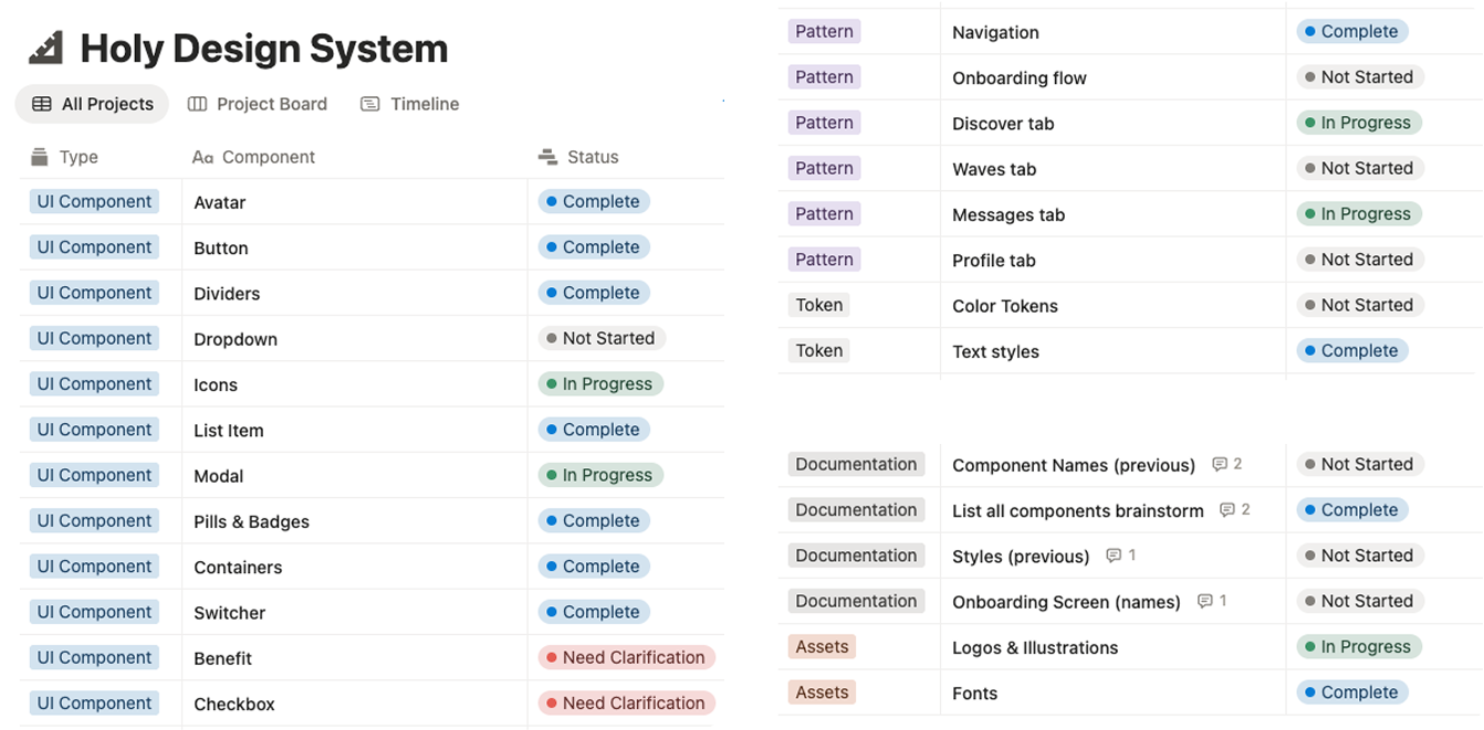
Starting with a full inventory, not a redesign

Before touching a single component, I scoped the work. The founders needed to understand what existed, what needed to change, and what the handoff would look like — in a format they could track alongside their other priorities. I built the full project plan in Notion so they had visibility without needing to be in Figma every day.

The inventory phase covered every component in the existing Figma file: naming, usage, duplication, and whether it matched what was actually in the codebase. That audit became the prioritization layer — what to consolidate first, what to leave for later, and what could be deprecated entirely.

Notion project management board for UY design system

Project tracking in Notion — scoped by phase, with status visible to founders at all times
Process · Typography Audit

Documenting two systems to create one

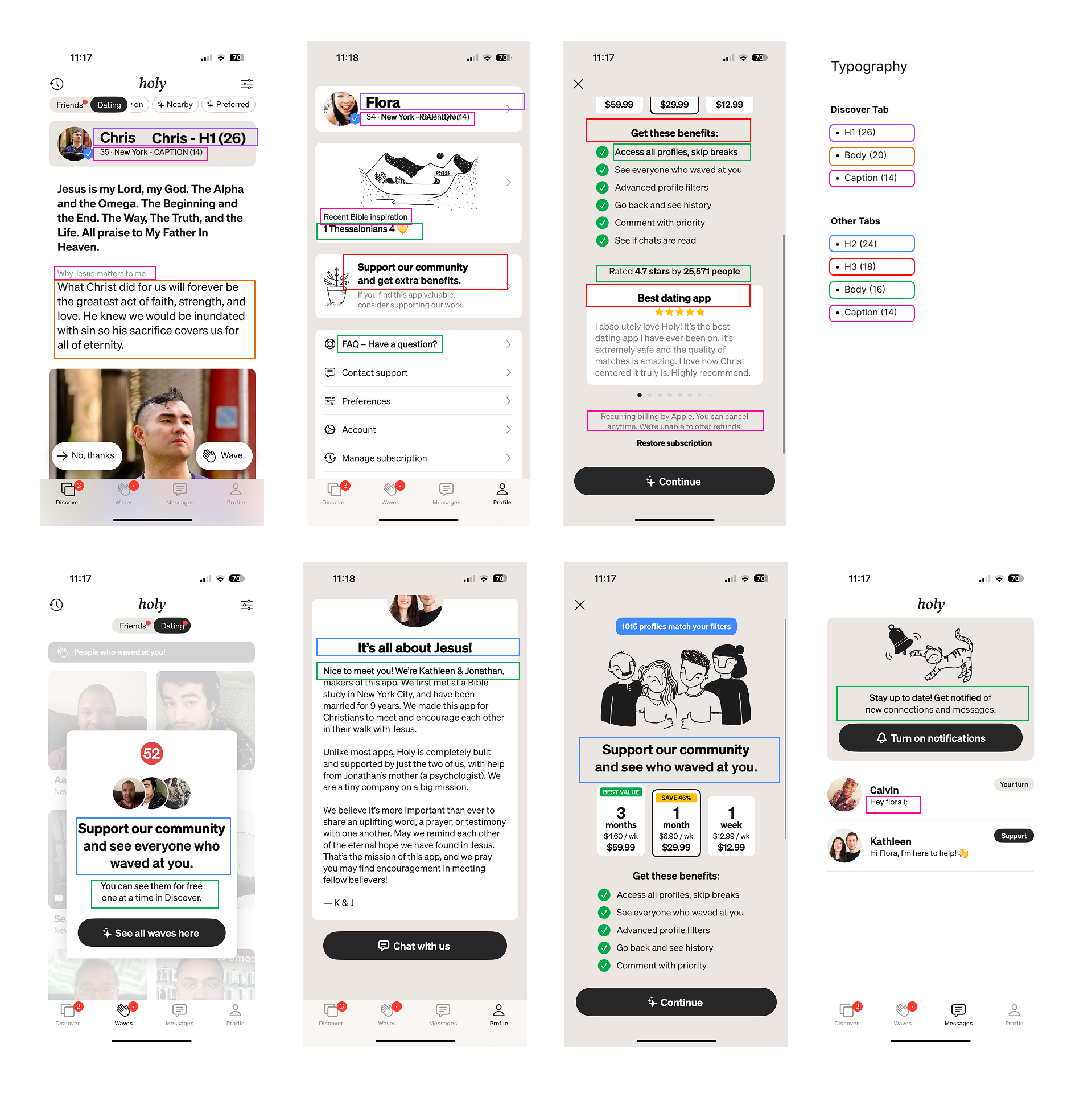
The type audit was one of the first concrete deliverables — and one of the most clarifying. I documented every typeface, size, weight, and line-height in use across the product, mapped to the screens where they appeared. The goal wasn't to pick a winner arbitrarily; it was to show the founders exactly what they had and make the consolidation decision obvious.

The situation
Two different type systems had evolved in parallel — one for core product surfaces, one that had crept in through newer feature work. Neither was wrong in isolation. The problem was that neither team knew the other existed, so they kept propagating.

Once the audit was documented, the path forward was straightforward: one canonical type scale, applied consistently, built into Figma styles so designers couldn't accidentally introduce a third system.

Typography audit showing two competing type systems

Type audit — both systems documented, divergences mapped to screens

Process · Figma Library

Building the library the team would actually use

A design system is only as good as its adoption. I structured the Figma library around how the team already worked — components named to match what developers called them in code, variants surfaced the way designers reached for them, and coverage prioritized by what shipped most often.

Before publishing, I synced naming conventions with the development team. This step is often skipped when designers build systems without engineering alignment, and it's the source of most implementation drift. We agreed on a shared vocabulary up front so the component names in Figma matched the component names in the codebase exactly.

01
Component inventory & consolidation
Audited every component in the existing file. Merged duplicates, deprecated unused variants, and established a single source of truth for each UI pattern.
02
Dev naming sync
Aligned Figma component names with the codebase before publishing. Eliminated the guesswork that was causing implementation drift between designs and shipped code.
03
Shared library publish & documentation
Published the library to the team workspace with usage documentation — enough context that the team could extend it independently after handoff.

Figma component library — live setup showing the system in use

Outcome · In Product

A consistent product the team could move fast in

The system shipped into a live, revenue-positive product — so it had to work immediately. The mobile screens below reflect the consistency that became possible once the library was live: typography rendering uniformly, components behaving predictably, and no more visual drift between screens designed by different team members.

UY app mobile screens showing consistent design system applied

UY mobile app — post-system consistency across screens

Results

The system went live across the full team within the 4-month engagement. Adoption was complete — not gradual — because the library had been built around how the team already worked, not how design systems theoretically should work.

100%
Team adoption of the design system on day one of publish
No parallel workflows. Clean cutover.
Faster concept-to-release for new features
From weeks to days on standard flows
30%
Reduction in QA time per release
Visual consistency checks no longer manual
The founders got their time back
The system removed the founders from the design consistency loop. They stopped being the QA layer for visual correctness and went back to building product.
The team could extend it independently
Documentation and naming conventions were clear enough that new designers onboarding after my engagement ended could contribute to the library without needing me to explain it.
Speed without fragility
Moving 3× faster didn't introduce new inconsistencies. The system held because it was built for the team's actual workflow, not a generic best practice.